You are using an out of date browser. It may not display this or other websites correctly.
You should upgrade or use an alternative browser.
You should upgrade or use an alternative browser.
Base Maps from 550 BC to Modern Day, all in UCS! Part Duex
- Thread starter CalBear
- Start date
Alex Richards
Donor
First and foremost, great start, I've just got some thoughts though:
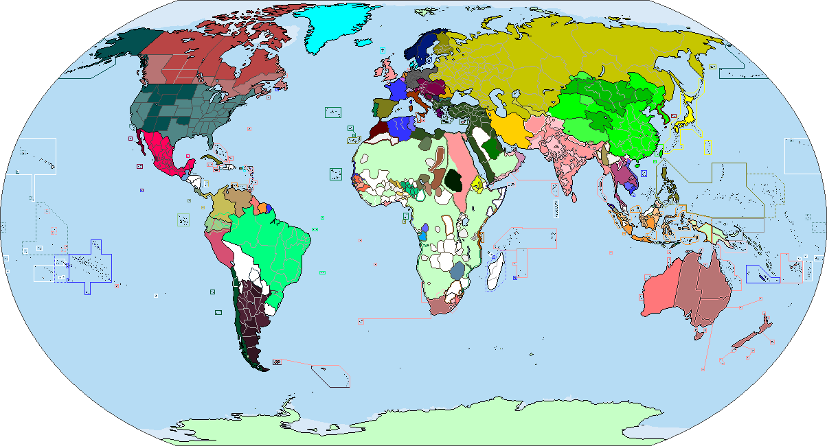
1. I assume you're using that orange to indicate stuff to look up the details on at a later point?
2. That's certainly an original way of showing the single-pixel islands, but I'm not sure it's particularly aesthetic (the Argentine claims to the Falklands look particularly off) and really falls apart in the Pacific considering that you can't see the borders between Palau, Micronesia and the Marshall Islands, and as we don't actually have a colour for PNG you'd have a big issue for the Solomons (plus Fiji, Samoa, Tuvalu, Tonga, Kiribati etc- we're definitely not having a colour to distinguish Kiribati from Tuvalu).
3. The way you've shown the ASSRs is very inaccurate- they were basically just Oblasts with a fancy name. Ditto with the modern Republic/Oblast distinction. LSCatilina has used a 'de facto autonomous area, de jure integral' outline method before (as well as for China which also has 'autonomous' areas).
4. I'm not entirely sure about the Warsaw Pact being that way either, but I think it's more that we need to go through and look at how individual countries should be shown more than anything.
5. What's going on in China in the 45-48 period?
6. If you're using my 1885 basemap for Africa, I've done an updated version (also including a British territory colour for Representative government as opposed to direct rule).
7. For the love of god though, don't include the Indian reservations- not only are they basically irrelevant, most of those are wildly anachronistic for the 19th Century maps.
Alex Richards
Donor
Ah, it appears the updated version didn't post. The main changes are the fact that Futa Djalloon was quite expansive at that point, and that I'd missed off the Wasoulou Empire, the remnant Kingdom of Kong and the Bariba Kingdoms in Benin.

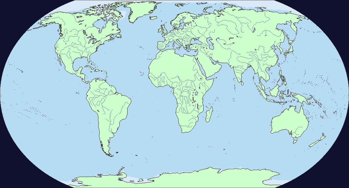
Does someone keeps track of the updates of the basemap, specifically with the rivers? If not, could someone upload something on it?
(And possibly update the wiki archives)
(And possibly update the wiki archives)
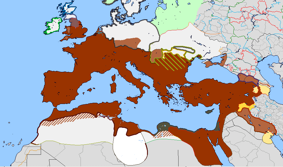
WIP on a 117AD Q-BAM. I think the Roman Empire is essentially over, but is there something wrong with it?

WIP on a 117AD Q-BAM. I think the Roman Empire is essentially over, but is there something wrong with it?
Did you also adjust the coastlines? they look a bit odd.
If you did, the mouth of the Po river is wrong. The coast advanced a few miles in 2k odd years, so you should take that bump of land off.
http://www.e-perimetron.org/vol_4_4/bitelli_cremonini_gatta.pdf
2016 so far
This is absolutely insane please let me give you all my money holy hell.
Alrighty, given a quick go at fiddling around with borders & coastlines. Antarctica, as always, is a pain.

EDIT: Relevant for any work being done on ice caps.

EDIT: Relevant for any work being done on ice caps.
Last edited:
You're keeping a lot of outdated coastlines and borders (an exemple as many, Portugal northern border is quite wrong) for this basemap.
Not all, just the Gulf of Santones.Did you also adjust the coastlines? they look a bit odd.
However Alex RIchards is greatly helping me by tacking care of these.
Don't worry, I intend to take them in account as I did with the 814 map
Didn't know that, thanks for the advise. Feel free to search others, or on the 814 as well.If you did, the mouth of the Po river is wrong. The coast advanced a few miles in 2k odd years, so you should take that bump of land off.
http://www.e-perimetron.org/vol_4_4/bitelli_cremonini_gatta.pdf
Alex Richards
Donor
Alrighty, given a quick go at fiddling around with borders & coastlines. Antarctica, as always, is a pain.
EDIT: Relevant for any work being done on ice caps.
I'm not entirely sure what you're doing, but please take the Reservations out- they're not really relevant for 2016 and I for one am not going to try and research the boundaries for 19th Century reservations just to get consistency on something which was often rather more theoretical than actually on the ground.
If it helps, Lowtuff, there's some maps.
1) The most current basemap avaible that I could find

2) The most current river basemap avaible that I could find, but the coastline is outdated (in attached file)
3) The most current modern map I could find, but not only the coastline is outdated, but it's from mid-2014 (it should be fine for most of the world, tough, except places as Near-East and Central Africa)


1) The most current basemap avaible that I could find

2) The most current river basemap avaible that I could find, but the coastline is outdated (in attached file)
3) The most current modern map I could find, but not only the coastline is outdated, but it's from mid-2014 (it should be fine for most of the world, tough, except places as Near-East and Central Africa)

I'm not entirely sure what you're doing, but please take the Reservations out- they're not really relevant for 2016 and I for one am not going to try and research the boundaries for 19th Century reservations just to get consistency on something which was often rather more theoretical than actually on the ground.
That's not my work, its Aslan's. Having a worlda map of reservations is helpful as a resource but shouldn't be part of the actual worlda, I agree. As shown by all the tiny pixels and such, it's a hell of a lot of work for not much significance anyhow. Apologies if I seemed like I was tyring to impose anything all the same, I'm just playing around with the details.
Also, LSC, thanks for the maps! I've been working based off of a slew of maps from a year or so back alongside some of my own modifications, so this really helps!
Don't worry : Alex barks loudly sometimes but he doesn't bites. It's a discussion thread after all, and we tend to experiment sometimes (I remember how long the discussion onto how represent statelets), so for one, I think it's fine.Apologies if I seemed like I was tyring to impose anything all the same, I'm just playing around with the details.
Glad to be of assistance!Also, LSC, thanks for the maps! I've been working based off of a slew of maps from a year or so back alongside some of my own modifications, so this really helps!
Alex Richards
Donor
Don't worry : Alex barks loudly sometimes but he doesn't bites. It's a discussion thread after all, and we tend to experiment sometimes (I remember how long the discussion onto how represent statelets), so for one, I think it's fine.
Glad to be of assistance!
Yeah, if it came across as overly aggressive it's only because I'd mentioned the point earlier.
And yeah, we've had some very long discussions on things- how to show the BOTs is a perennial one.
Yeah, if it came across as overly aggressive it's only because I'd mentioned the point earlier.
And yeah, we've had some very long discussions on things- how to show the BOTs is a perennial one.
No worries man, you some truly amazing work around here and I totally get the frustration over the issue. It's always the most fiddly things that drive you mad, after all!
And yeah, we've had some very long discussions on things- how to show the BOTs is a perennial one.
Don't forget "how to show colonies", that's a classic.
Alex Richards
Donor
Don't forget "how to show colonies", that's a classic.
Oh yes. It's telling that we've basically got to the stage of saying we've got the same set of colour types for Britain, France and the US, but they're all used in different ways because otherwise we'd need 8 colours for each major nation.
Oh yes. It's telling that we've basically got to the stage of saying we've got the same set of colour types for Britain, France and the US, but they're all used in different ways because otherwise we'd need 8 colours for each major nation.
In 10 years time the map will be over 100k pixels wide and there will be different colours for every type of england's administrative units and the borders between them. Loading it will crash a computer.
That aside, I'm inclined to side with you here, having varying, subjective and admittedly arbitrary standards for what is and isn't included seems to be the way forward. More detail is fine when collecting resources, but if you try to smash all the complexity and accuracy you can into a single map you'll quickly go insane.
Share: